The Brand
Hila Sarel is a self employed lawyer, specializing in family and real estate law.
Brand Voice
Hila Sarel brings dedication to its customers while supporting them a dire times. She is a professional to lean on at times of need. The brand aims to protect and voices integrity and excellence.
Logo
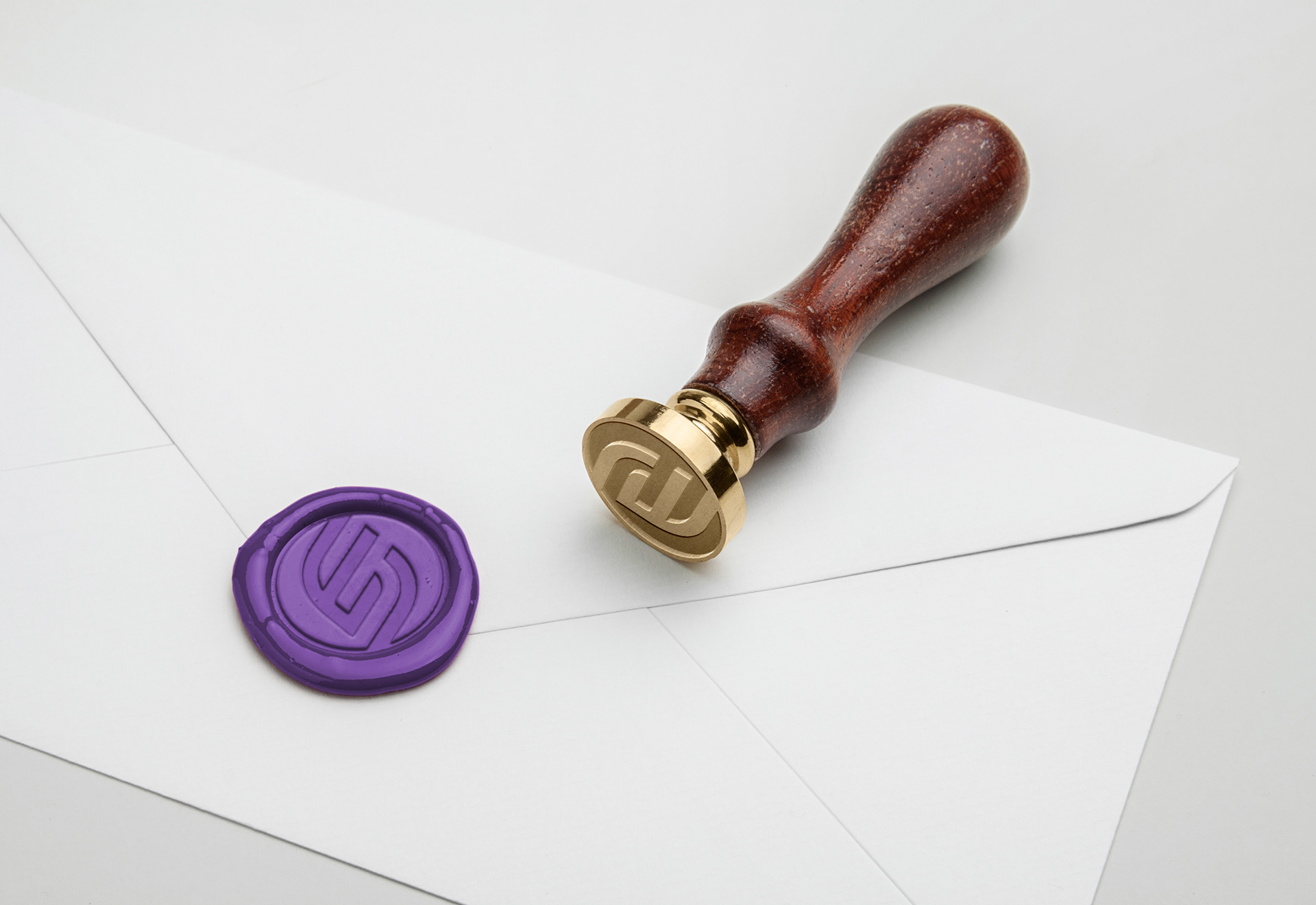
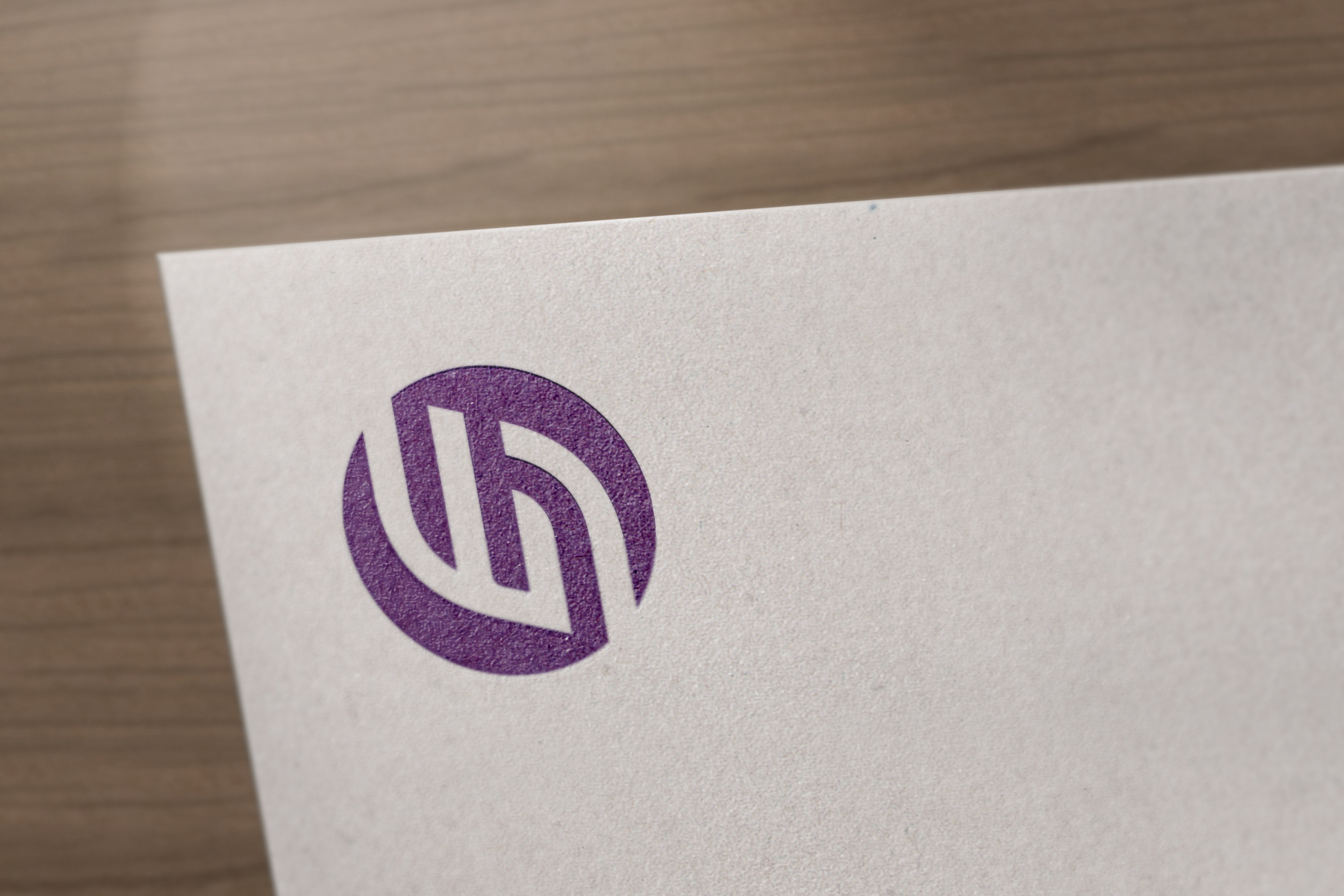
In Israel the law prohibits lawyers from using logos as other professionals do. A lawyer's logo can only be made of the attorney's initials. The logo is composed of two Hebrew letters fused together. The letters are the first letters of her name and surname. The combined form is rhythmic and clean to convey a sense of assurance and reliability. The purple color was chosen as it is quite uncommon in the law market, while still portraying the calm and stability of blue it encompasses the energy and warmth of red. The purple adds wisdom and nobility to the mix.
Scope
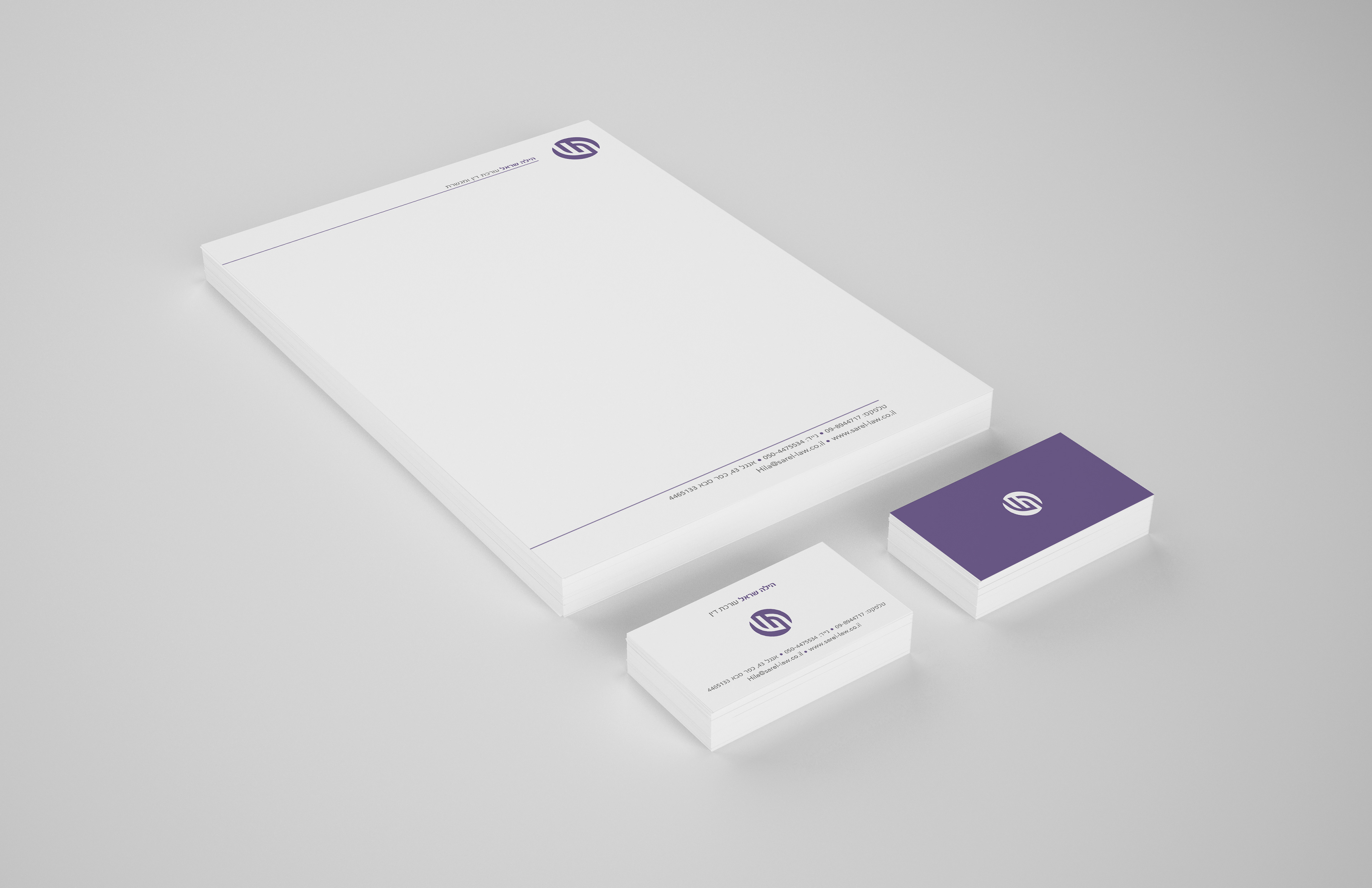
This branding language is fairly simple in appearance. I had to keep the visual language very clear across all products to contribute to the feeling of assurance of Hila's customers. One tends to relate more to something he understands. Since lawyers often use a wax seal, I tried to make the logo look like one. This is also useful because it can be used as a seal by itself or as a stamp.