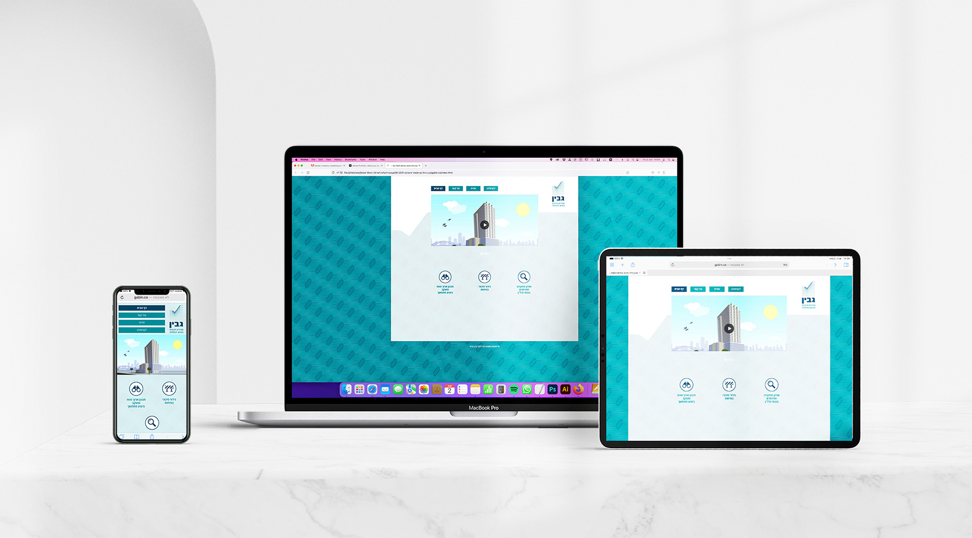
The Brand
Gabin bring to its customers the opportunity to control the way they manage and control their buildings maintenance. The company employs highly professional employees with many years of experience from the management and engineering fields.
Brand Voice
Gabin aspires to deliver a higher level of security, service and looks for the properties of its customers. The brand uses a high degree of professionalism to help its customers to plan ahead, and so to bring them stability and peace of mind.
Logo
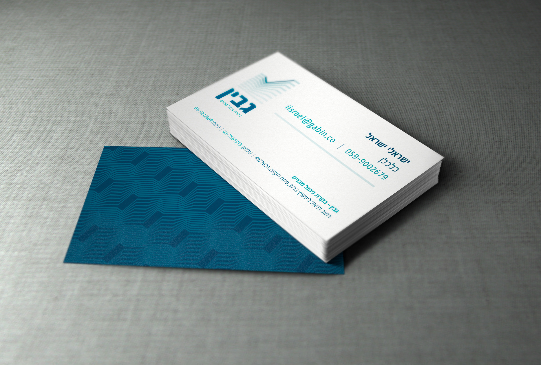
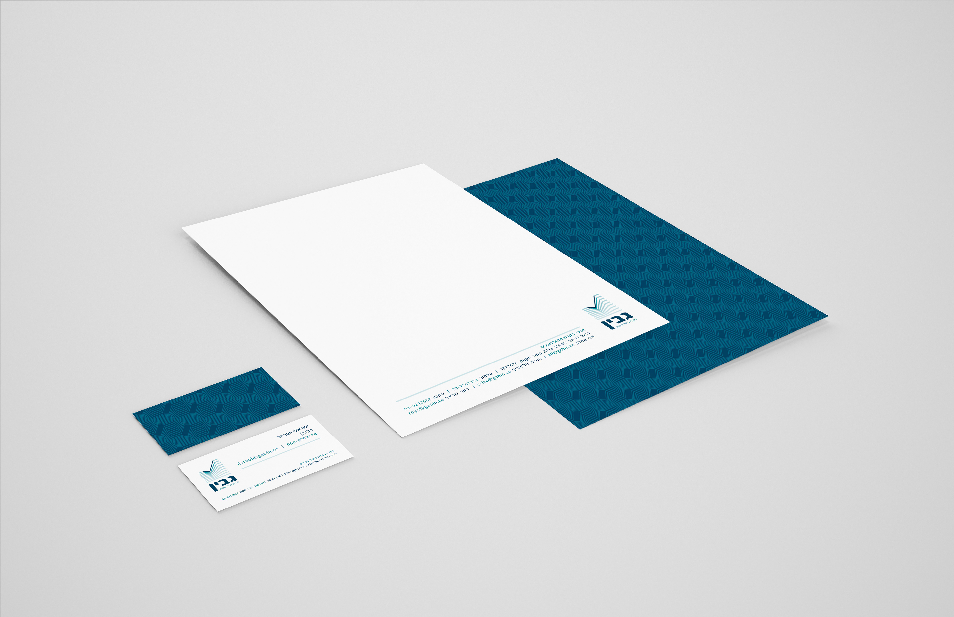
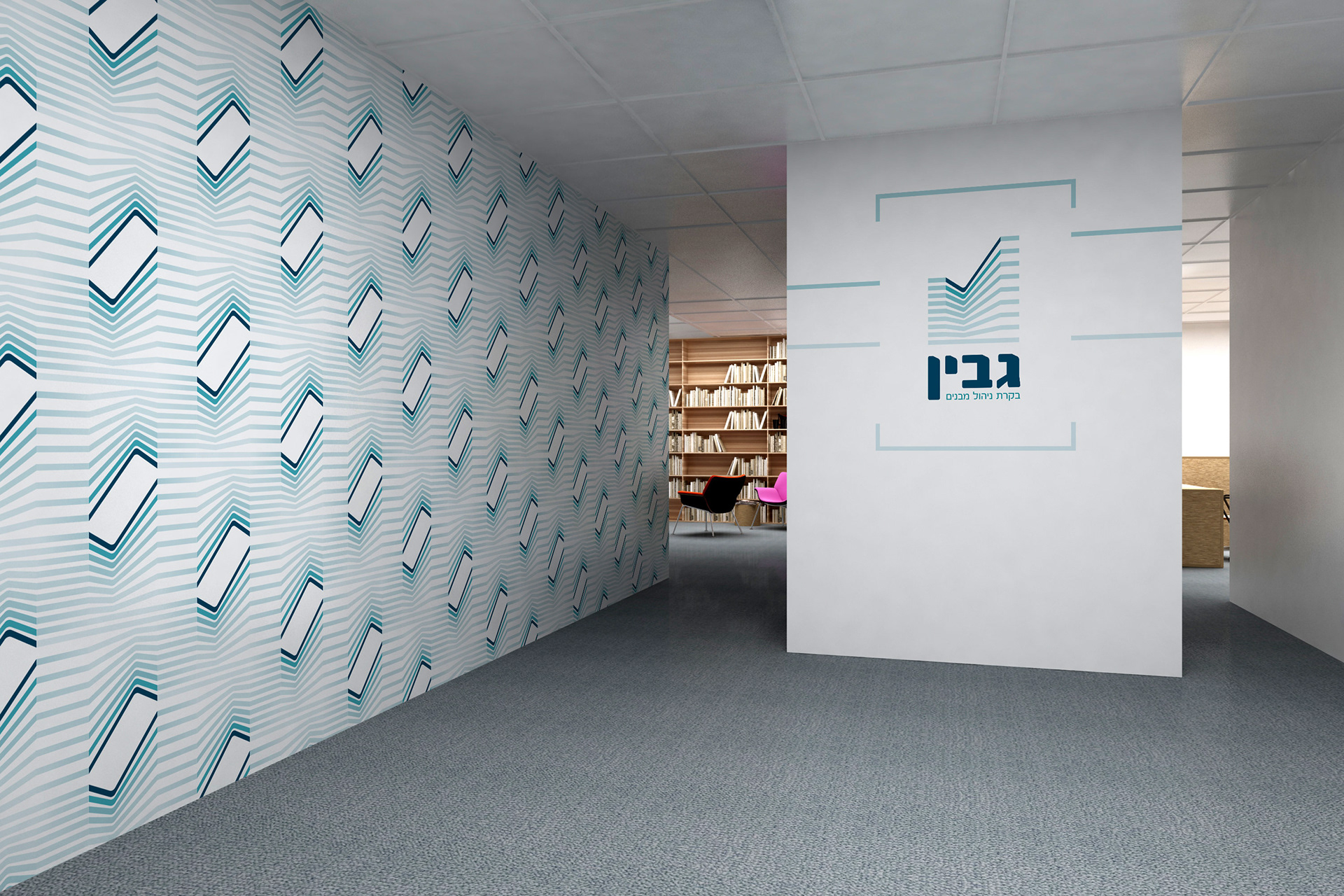
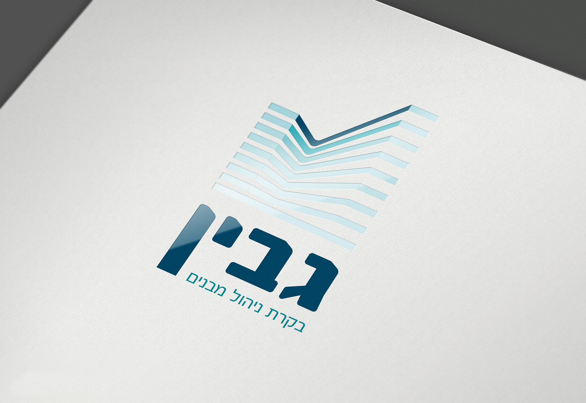
The logo is composed of the name 'Gabin', written in Hebrew. The tag line at the bottom reads: 'buildings management control'. The bold lettering and the overall balanced structure of the logo emits stability. The lines create an image of a building. The color variation forms movement towards the top which is actually a 'V' mark, the mark of authorization. The 'V' mark corresponds to the authorization given by Gabin to its customers buildings.
Scope
On this project I had to not only come up with a visual language for the brand, but also to find a short enough tagline to effectively describe the brand. I decided to use the lines from the logo as a repeating motif and create a texture. The texture resembles a wallpaper, again, a building motif.