The Brand
Carrot - Design Studio is a boutique graphic design studio which, over the years, added many abilities and tools to its arsenal. It has become a problem solver to everything design and its designers are ready for any challenge.
Brand Voice
Carrot Design Studio is aiming to bring the dedication of its designers and their love of design to its customers. They always do it with a smile and its aim is to give its customers assurance and enjoy even the most challenging design process.
Logo
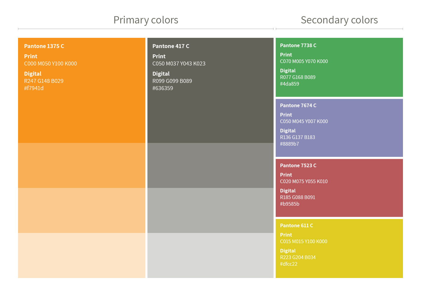
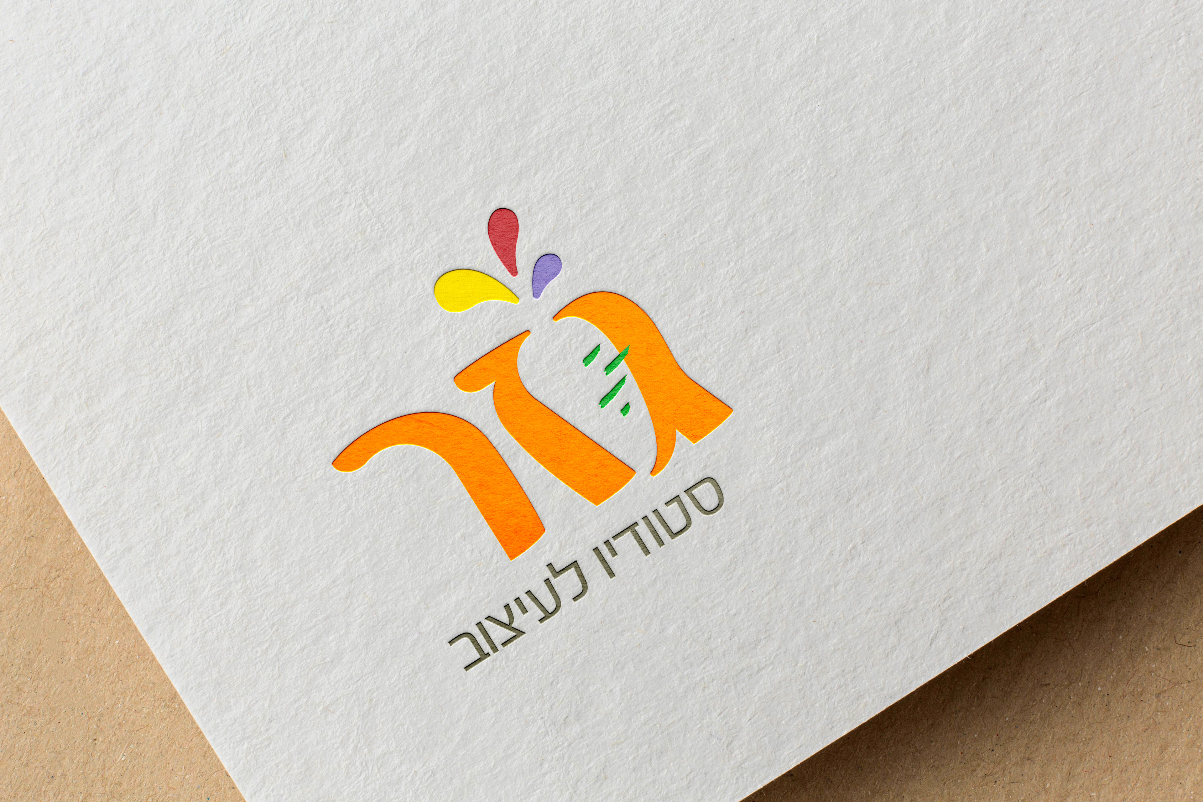
The logo is basically the word 'Carrot' in Hebrew (the two words at the bottom mean 'Design Studio'). The letters were altered to give the white space between the first two letter a carrot shape. This clever use of negative space declares the studio's dedication and ability to solve design problems. The carrot's leaves were replaced with colorful droplets that burst from the carrot. The droplets symbolize bursting creativity and their different colors stand for variety in abilities. The bright saturated colors are somewhat childish reflecting the playful and happy nature of the studio.
Scope
I was in charge of this branding process from the ground up. The challenge was to combine the obvious visual, a carrot, in a way that will be visually interesting. The way it did it proved to be very effective and also brought forward the studio's cleverness and problem solving ability. It took me a considerable amount of testing and carrots drawings before I landed on this option. I then elaborated the brand's language to include more products that are in use, both for digital and physical media.